
This photo looks well framed because it looks very equal.

Balance is shown because the placement follows the guidelines.

In this photo Simplicity is shown. The photographer pointed the camera up looking at the buildings.
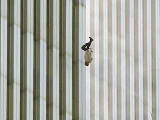
Lines is shown in this photo by showing the parallel lines in the background.
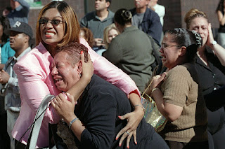
Rule of Thirds is shown in this photo by showing that the group of people are in the 'rule of thirds' frame.
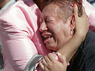
Avoiding Merges is shown in this photo because a lot of things in this photo is being cut of compared to the original photo.
 This photo looks well framed because it looks very equal.
 Lines is shown in this photo by showing the parallel lines in the background.
 Rule of Thirds is shown in this photo by showing that the group of people are in the 'rule of thirds' frame.
 Avoiding Merges is shown in this photo because a lot of things in this photo is being cut of compared to the original photo.


No comments:
Post a Comment